Initiating and leading Agorize Design System
Project Overview. At Agorize, I spent half of my time designing major features for our SaaS applications such as the Challenge Builder, Messages, Translation Center, the Voting platform, a complex filtering system... I spent the rest of my time on building our design system with front-end engineers.
Role
Product Design (User Research, UX/UI, Prototyping), Design Systems.
Duration
8 weeks
Teammates
1 Designer, 1 PM, 1 Lead Front-end Engineer

Recommendations from my coworker (Pierre), and my manager, Head of Product/Co-Founder (Yohan)
Problem
We had several problems such as inconsistencies across products (we had several products based on different front-end frameworks), inefficient workflow (designers would often do low-value repetitive tasks), inefficient collaboration (without any naming conventions, file structure, file versionning or a shared components library, designers struggled to work together), not enough time for research and prototyping (because of the lack of process we waste time on redesigning components and mockups), no knowledge sharing across the product/tech team or the company, bad collaboration with engineering
Defining design principles
To build strong fondations I wanted to define principles to guide the team in taking design decisions. I worked with the other product designer, brand designers and the marketing team to make sure we define design principles not only for the product team but for all people working on designing Agorize products, brand and communications.
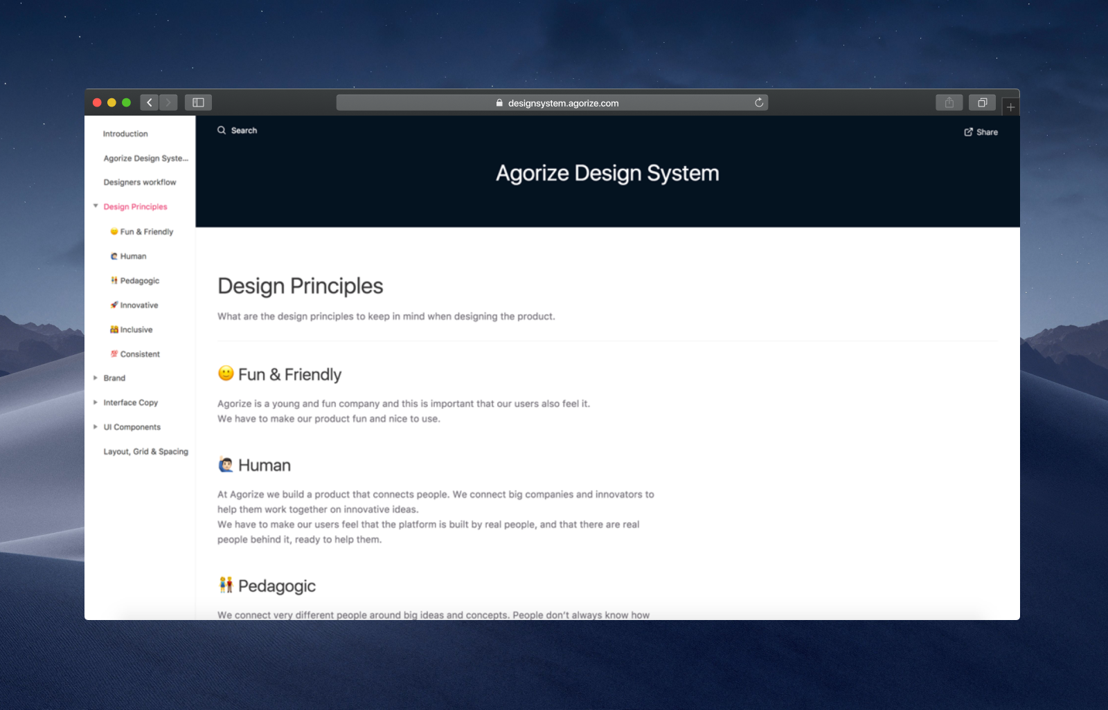
Design principles in the design system documentation
Colors
To define a systematic colors system, I decided to work with HSB values to easily define colors variations. We defined 9 necessary colors: our brand color (blue-brand), feedback colors (red, green, yellow) and gray scale colors. We then calculate the lighter and darker variations for these colors. Having those variations is really helpful in many ways — for instance, we use the lighter variation 1 for hover state. Agorize platform is also sold as white mark to many companies, so our clients only have to define their brand colors and their entire palette is systematically calculated. The lead front-end engineer, Adrien Moretti, wrote JavaScript functions to convert HSB values to HSLa for SCSS.
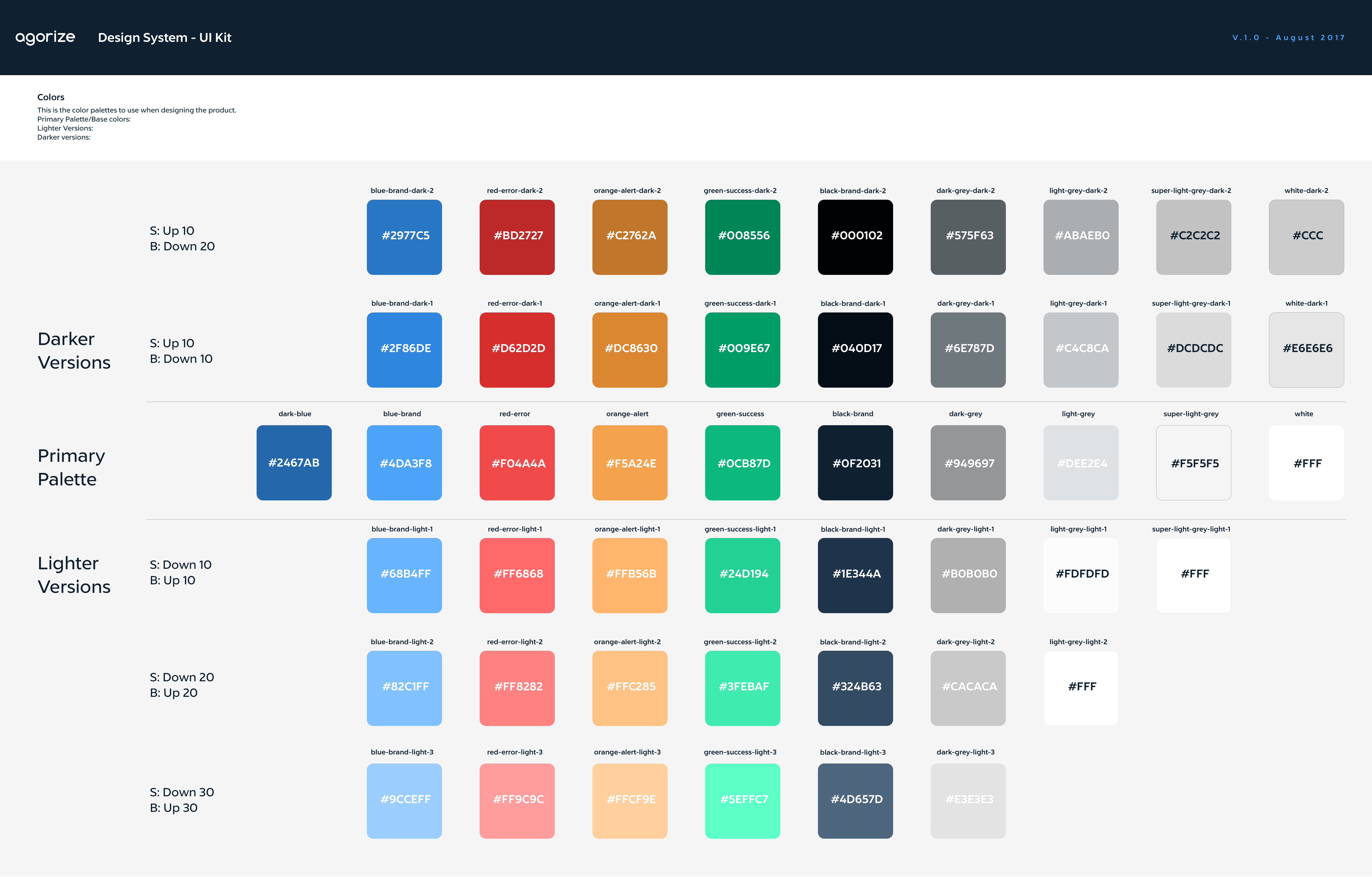
Color Palette
Typography
While defining typography and text styles, we decided to keep the typography we had: Lyszt. This grotesque typeface worked pretty well for us. We redefined text styles to keep only font-sizes and font-weights that are really necessary.
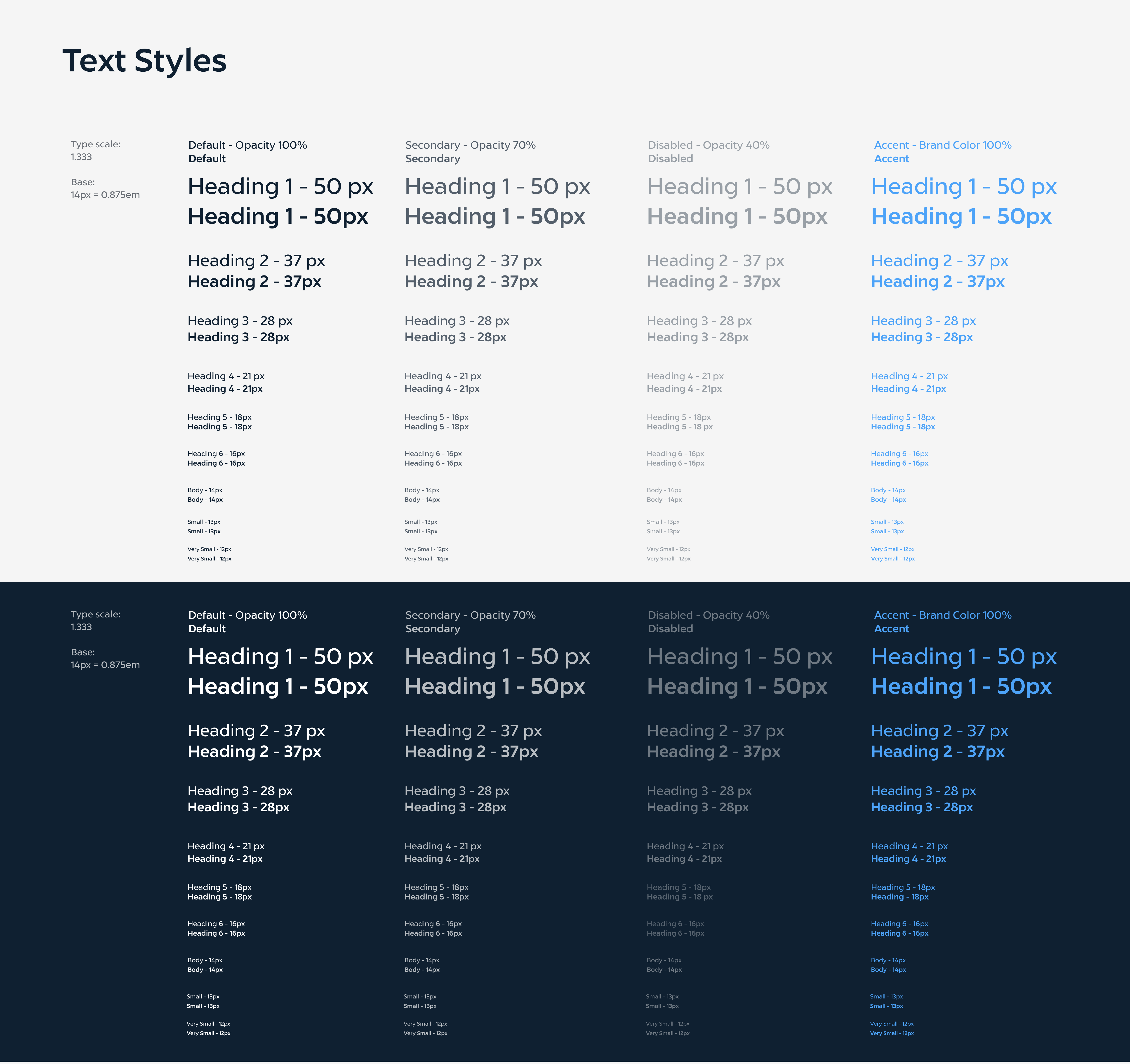
Typography styles
Icons
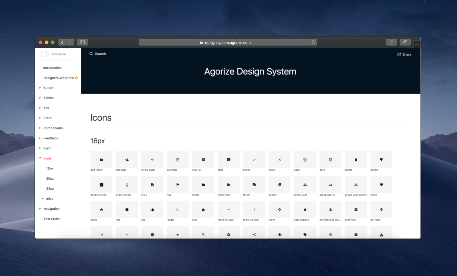
We used Material icons to create a SVG-based webfont with Icomoon, as we needed a large set of icons and didn't had the time to do custom iconography at this moment.
Icons
UI Audit & Design System backlog
When doing the inventory of all our components, I realized how big the project will be. After we decided which components need to be created, redesigned or deleted, I quickly created a spreadsheet to plan tasks and track our progress.
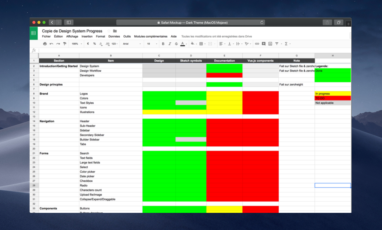
Spreadsheet used as backlog to track and plan progress
Designing Components
After defining principles, visual attributes, and planning the components design, it was time to start building the components library.

Example of organism broke down into molecules
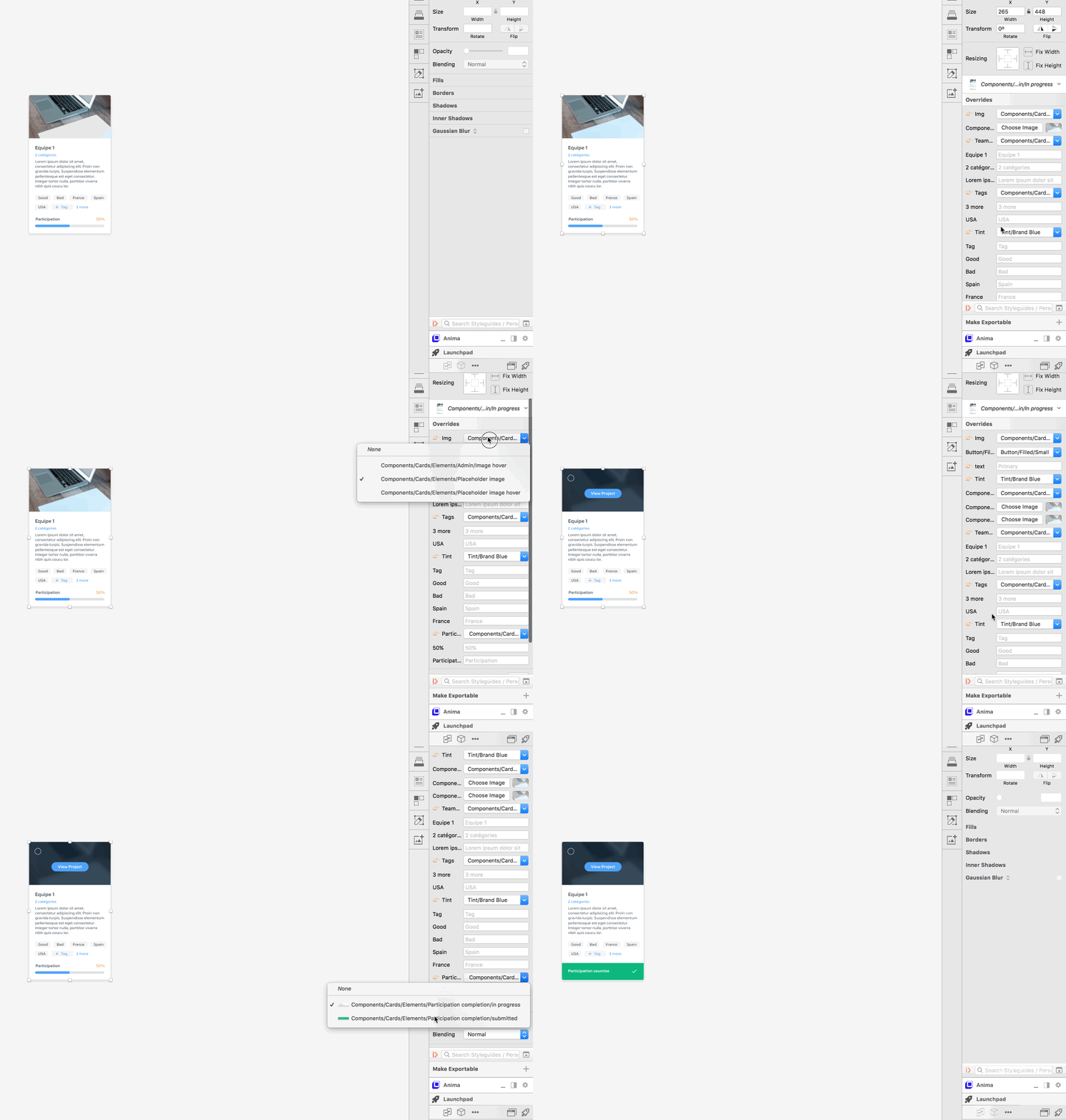
Changing the state of a component takes only a few seconds
Impact
Building this design system — or at least the first bricks — has been very useful for Agorize and the product team. There is a huge progress on the knowledge sharing — the team can easily refers to the System when doubting, or a new designer can easily understand how to design Agorize products by checking the design library and the documentation. There is also a significant progress on the productivity and workflow of individuals. Designers now work better, and faster. They have time to focus on research as the design system allow them to prototype faster and collaborate better than before. On the engineering side, the team killed the KSS Rails app and adopted a component-based development approach by switching to VueJS. There still is a lot of work on the engineering side but the team is on the right track. The evolution of the industry has helped us a lot as well — Sketch Libraries and other design systems tools like Zeroheight got released while I was working on our design system, the timing was perfect.

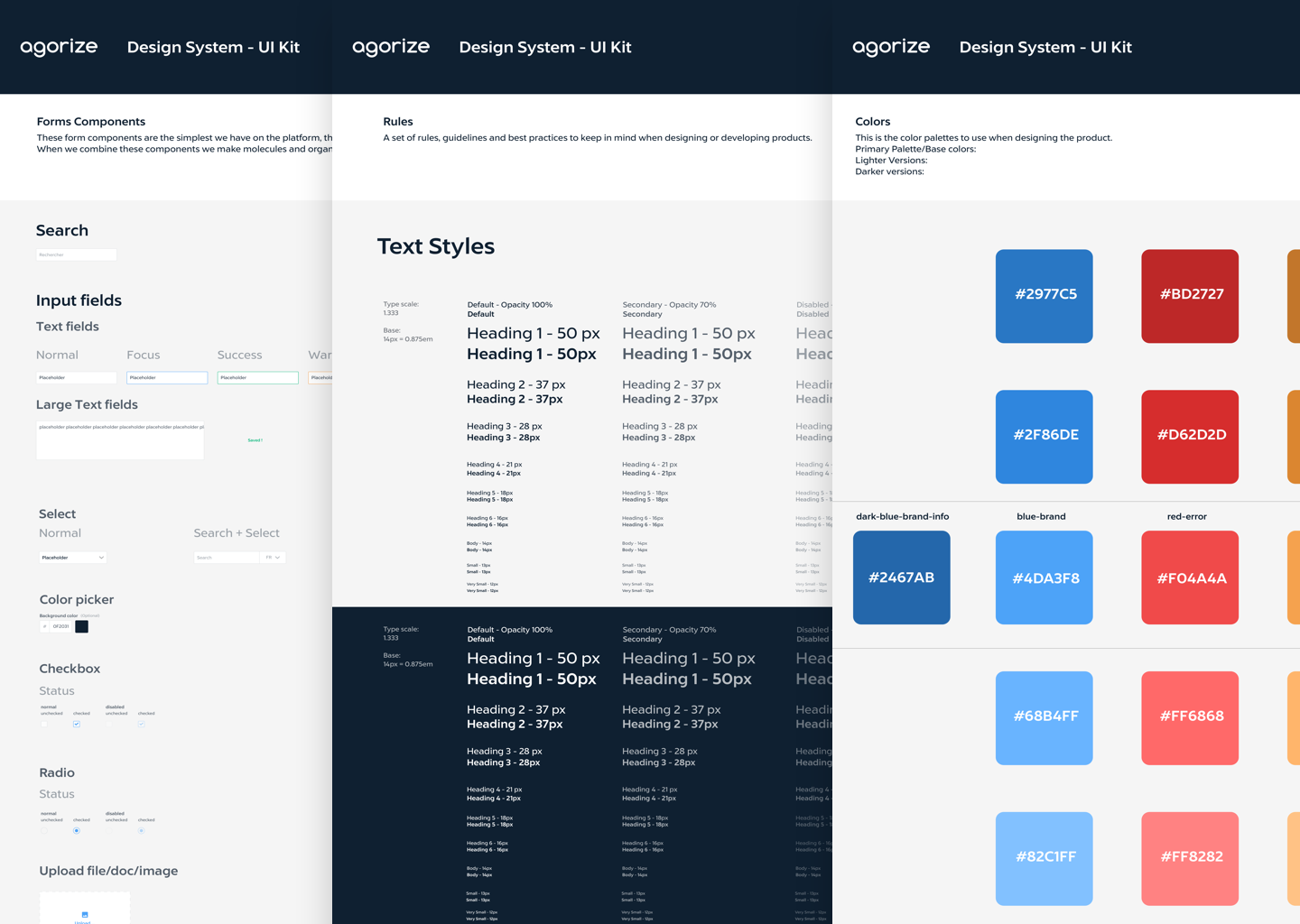
Forms components and visual attributes

Using the system
Here are some examples of screens I designed with the design system when working on features.
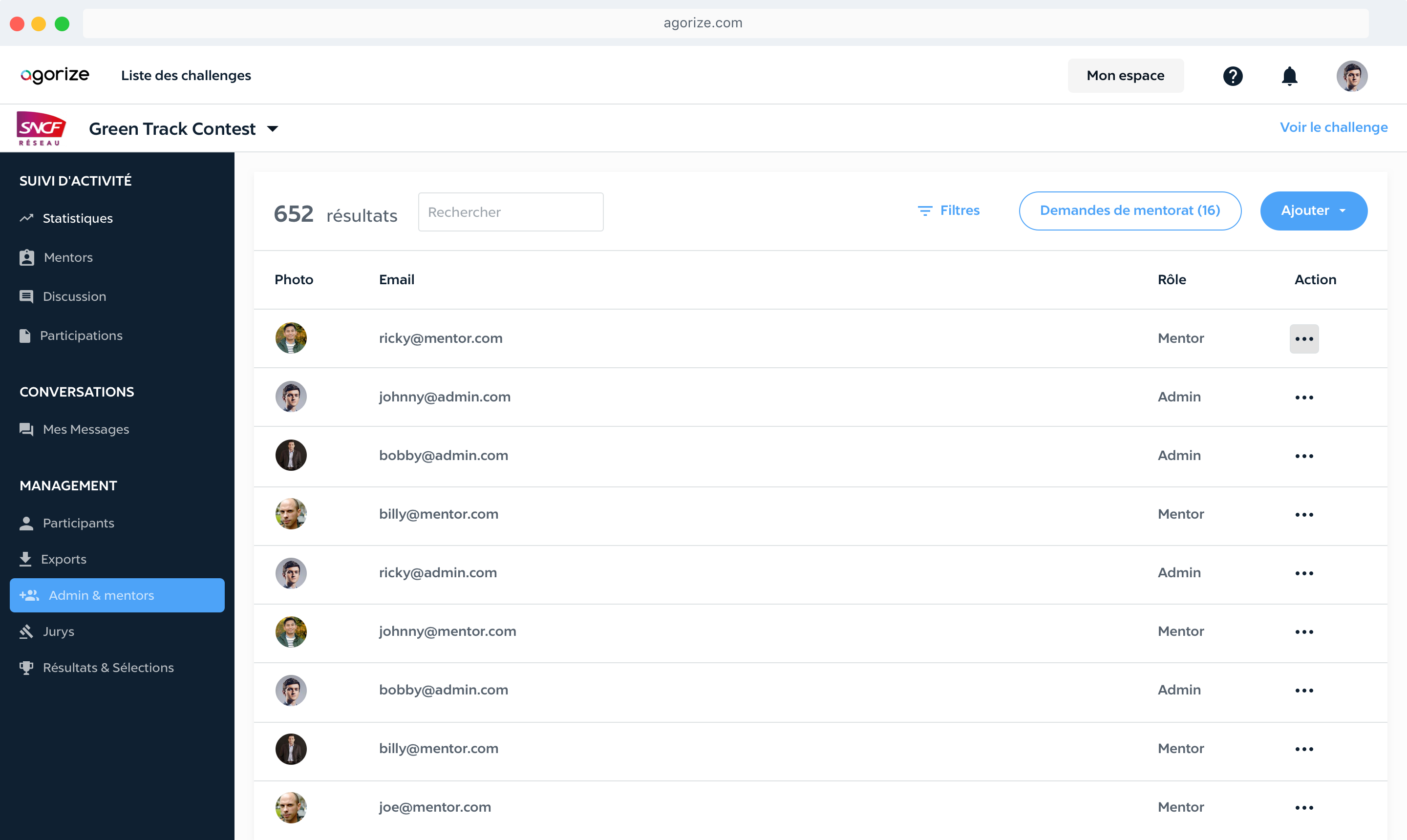
Admins & Mentors feature - it allows challenge organizers to manage user permissions
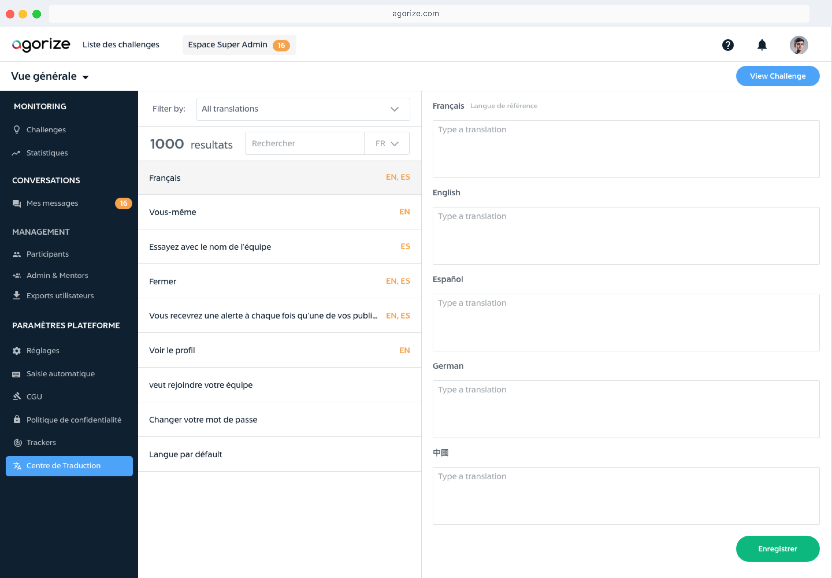
Traduction Center feature - it helps challenge organizers to manage multi-languages challenges
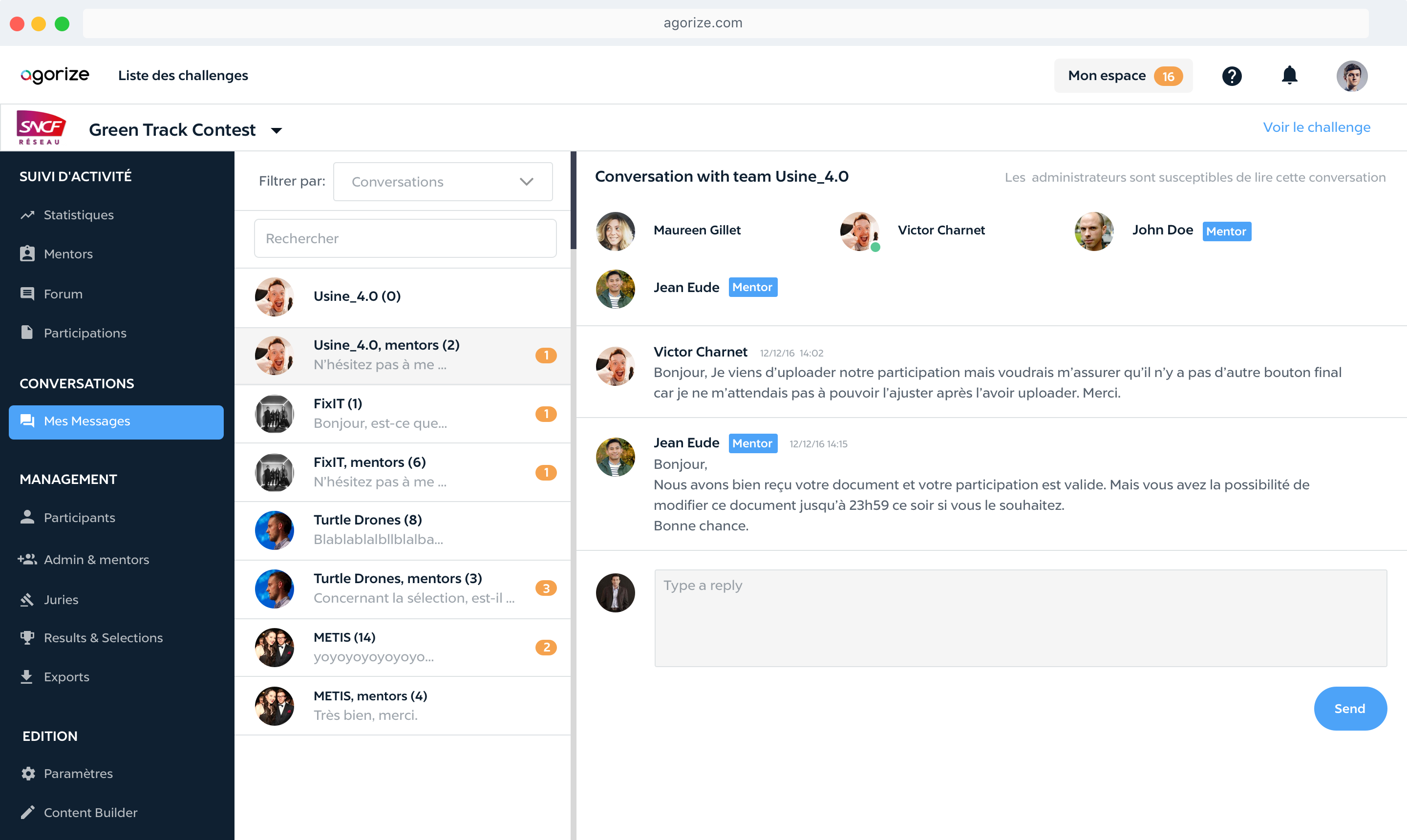
Messages feature — it allows challenge admins and mentors to chat witht teams participating
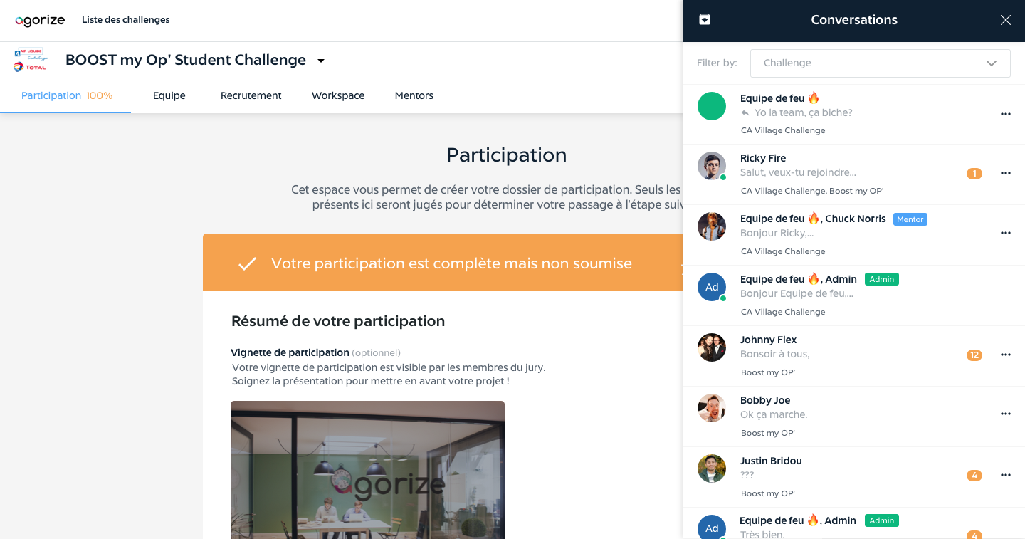
Messages feature - The same feature viewed from the Participant platform
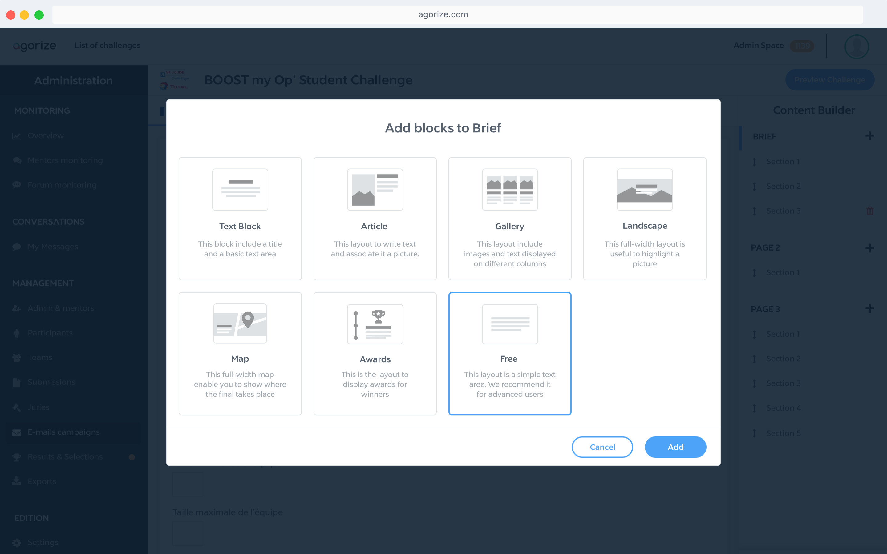
Challenge Builder feature — A page builder allowing admins design their challenge pages
Communicating and sharing learnings with the tech community
While working on the design system, I wrote an article to share my learnings with the design & tech community, to get feedback about our work and show how we work at Agorize, and also to connect with other design systems geeks. It made the Top 20 of the day, counts thousands of views and claps, and got shared by several companies and leaders in the industry, such as Chris Coyier, the founder of Codepen and CSS Tricks.

My article was in the top 20 popular articles on Medium on the publication day
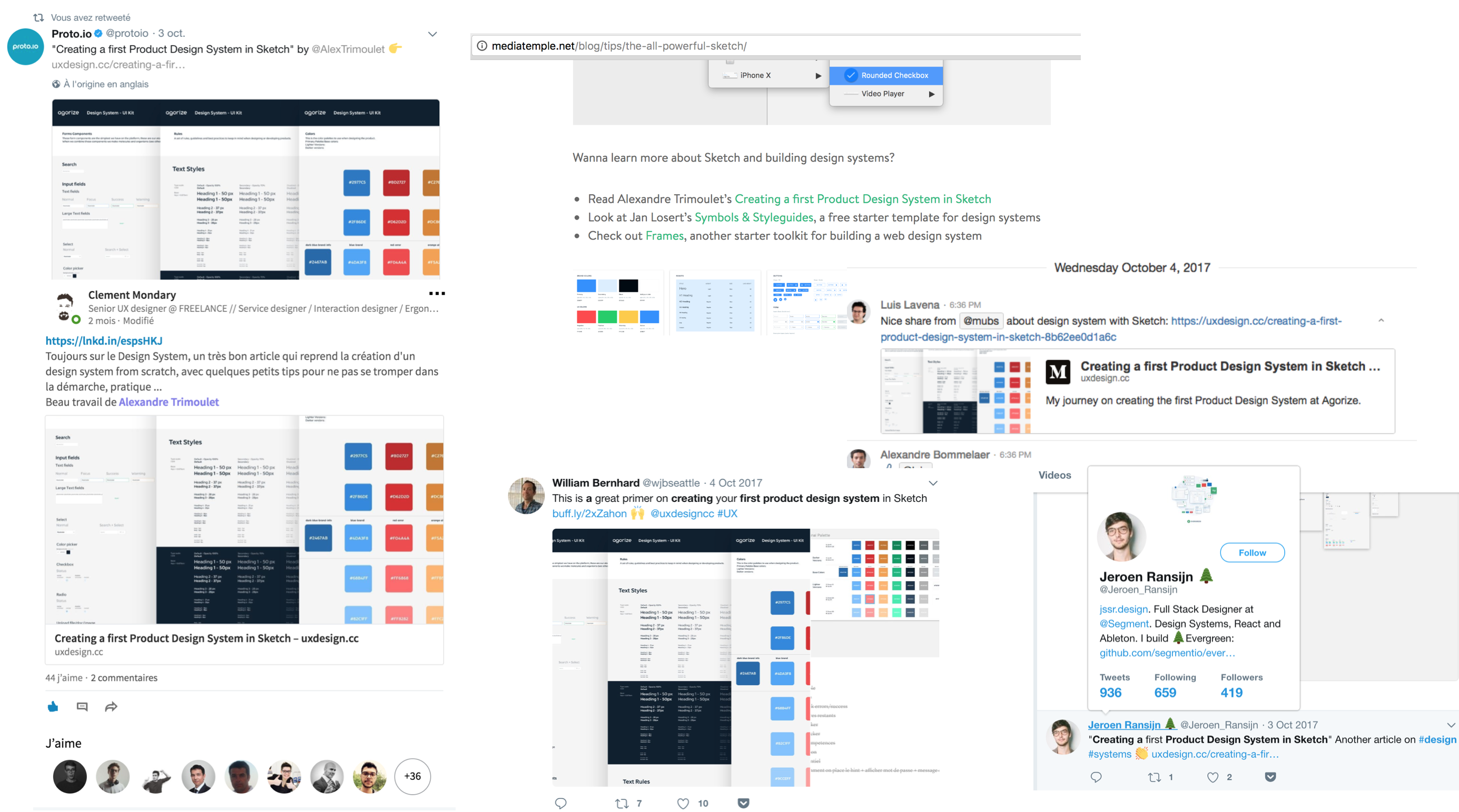
Many people across the industry shared my article
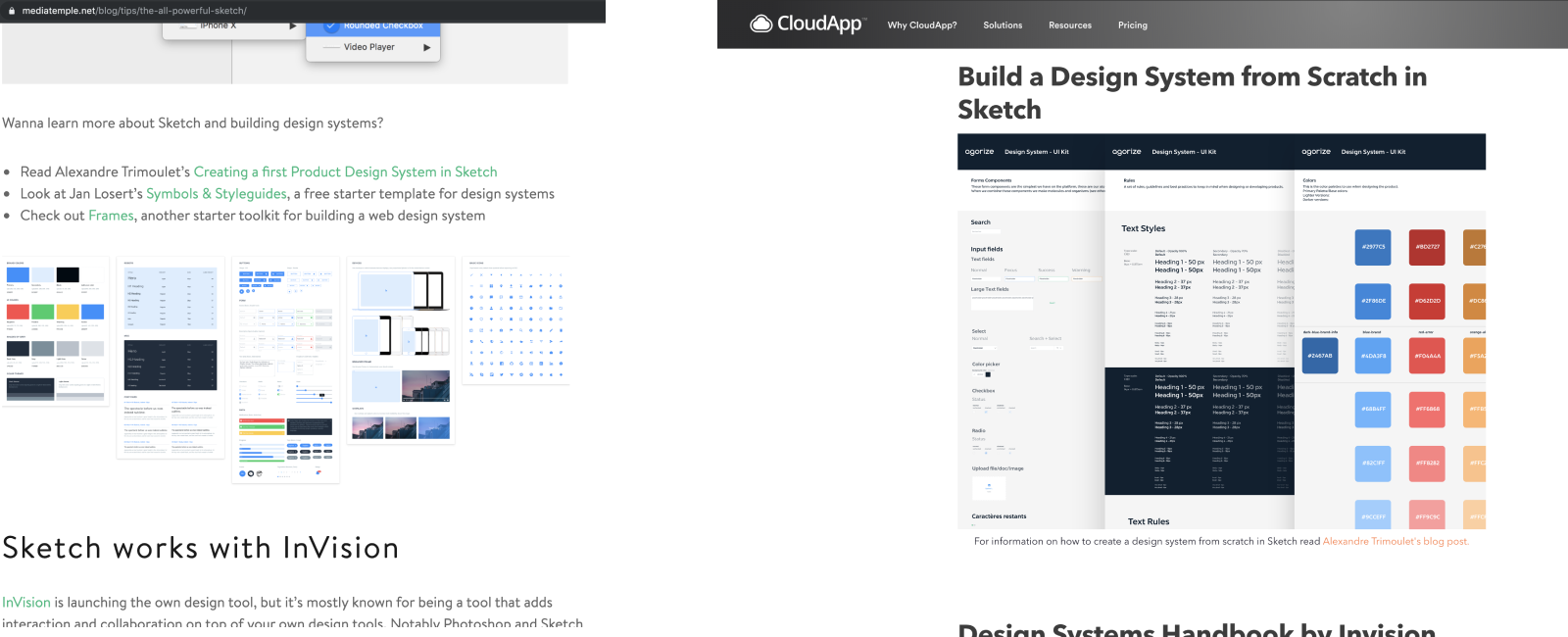
It has been cited in blog articles from industry leader like Chris Coyier, Founder of Codepen & CSS-Tricks (Left) and corporate blog articles like CloudApp blog (Right)