Designing the Challenge Builder feature
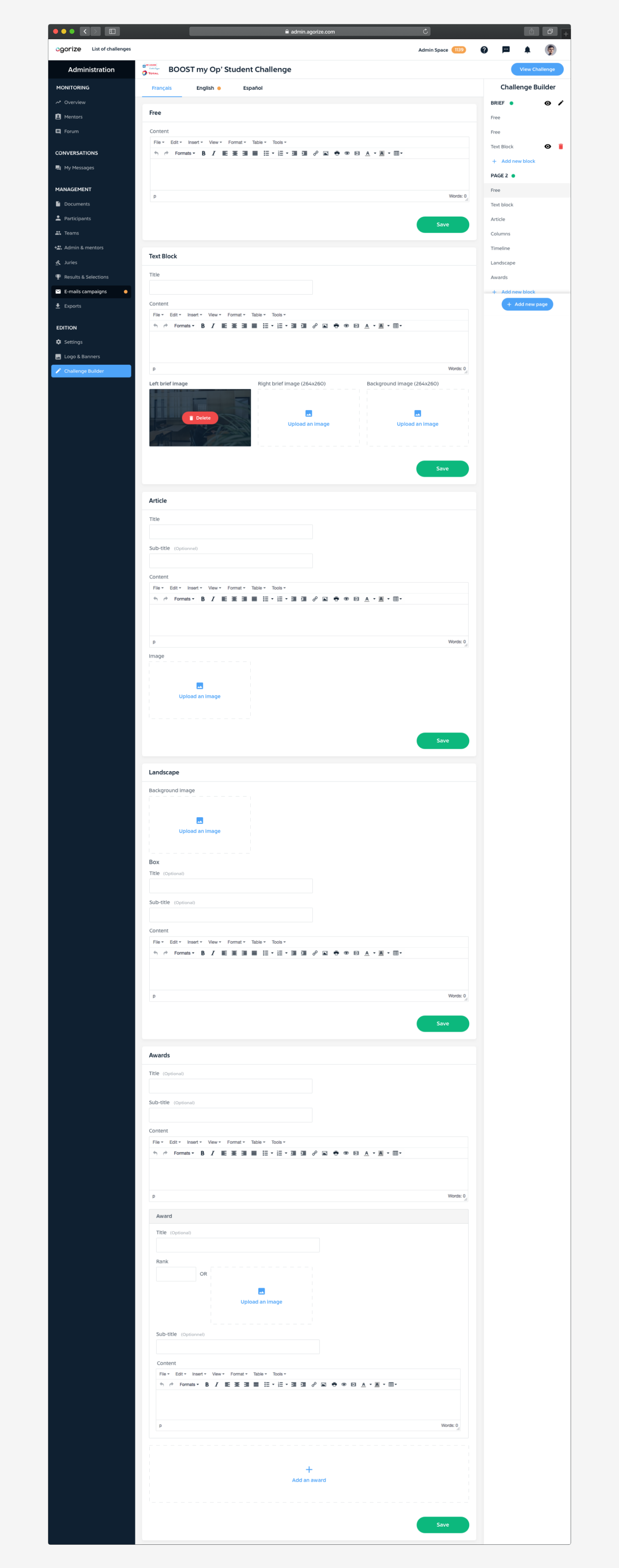
Project Overview. Agorize SaaS application allows big companies to organize open innovation challenges with participants around the globe. Here's how I designed the Challenge Builder, a visual page builder allowing organizers to design their challenge web pages.
Role
Product Design (User Research, UX/UI, Prototyping)
Duration
3 weeks
Teammates
1 PM and Engineers
Problem
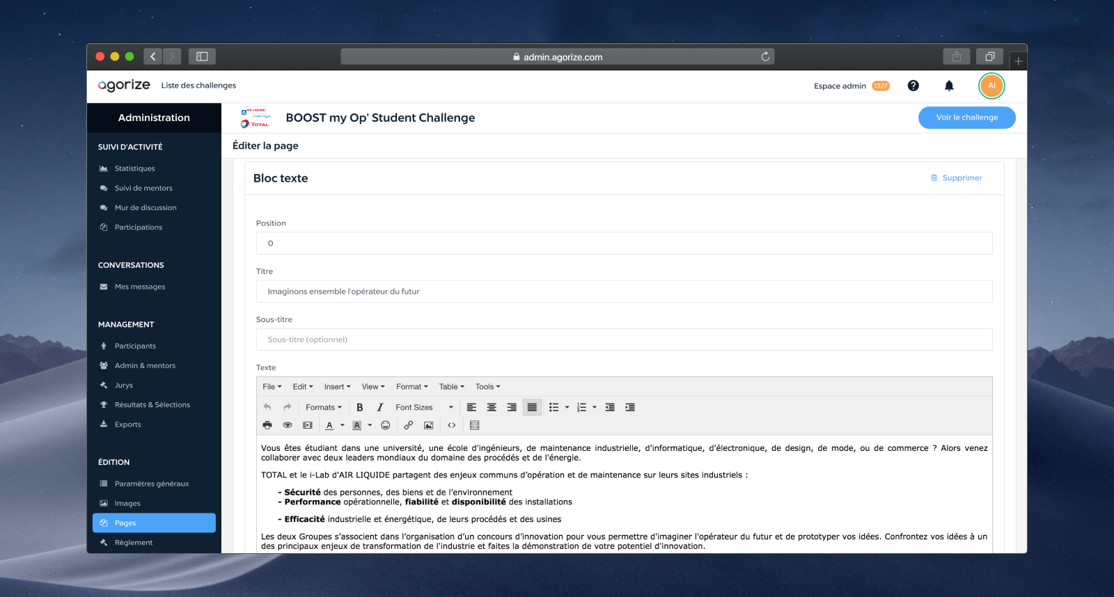
At Agorize, there is a team called “Project Alchemists” who work closely with customers to define the challenge brief, the awards, the number of participants, etc. Project Alchemists used to create challenges for customers but it was very time consuming and costly, and it didn't aligned with our vision of SaaS application. The existing solution allowing them to design the challenge pages was very basic, it was functional but very cumbersome. They had only a few differents “blocks” available, like Text, Gallery, Article, Map, and the only way to add and edit the content was with TinyMCE, a basic HTML editor. It was a very painful process to create beautiful pages with a lot of content and it was also quite difficult to navigate between pages and their different langages.
Solution
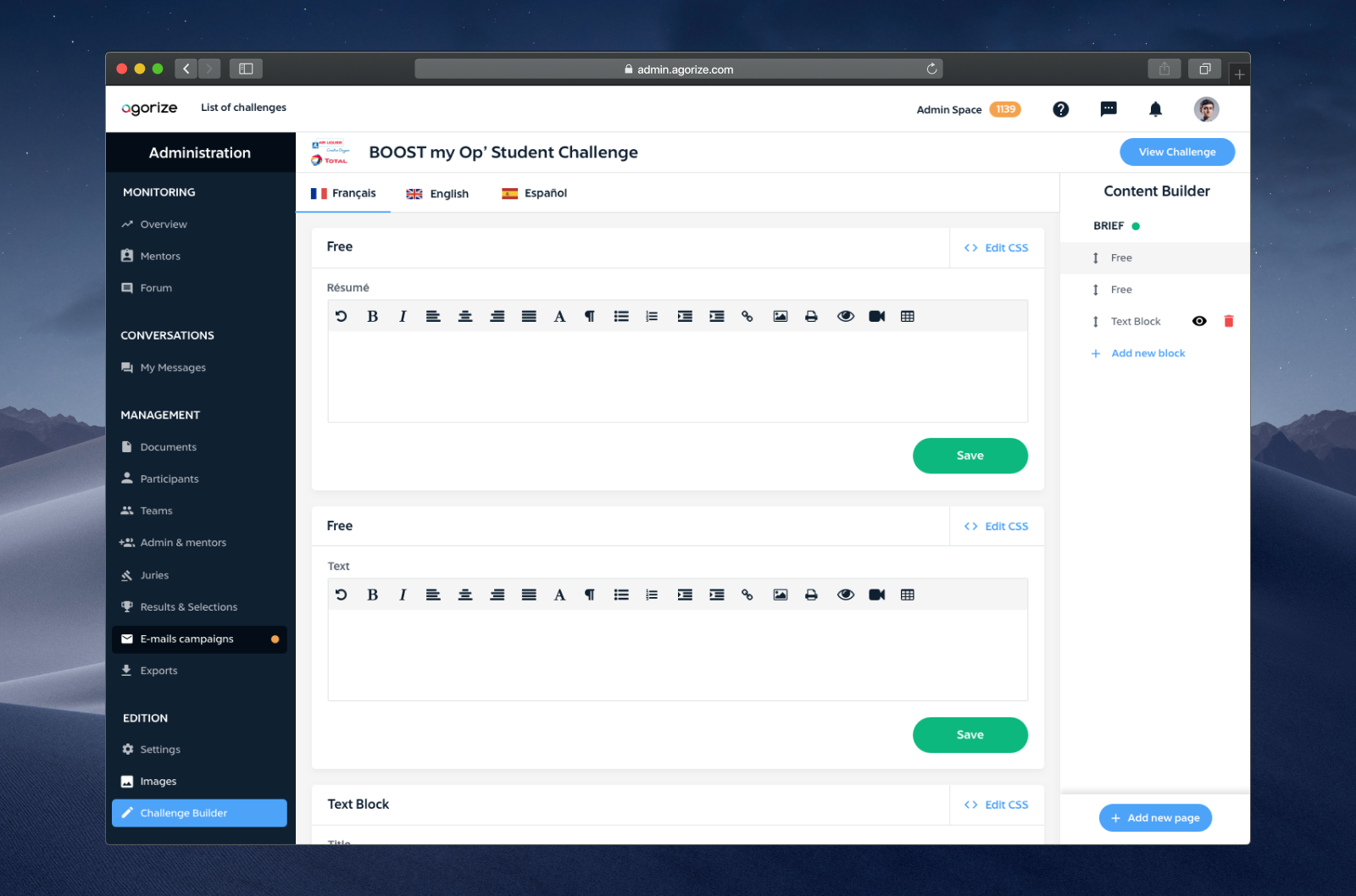
To solve this problem, I redesigned the navigation, existing blocks, and designed new blocks. The navigation now includes a right sidebar, allowing to add, edit, reorder or delete pages and blocks as well as navigate through them. I also designed a tab bar, allowing organizers to easily create multi-languages challenges. We also improved the HTML editor to keep only the features used by Projects Alchemists and clients, and added a CSS editor to give more flexibility. Users now also have to the ability to save and publish blocks independently from others blocks, and they can save pages as drafts and preview them. This solution significantly reduced the time Project Alchemists have to spend working on challenge design with clients and allowed some clients to design their challenge by themselves.
A deeper look into the design process.
User Research
When I started to work on this feature, I organized meetings with Project Alchemists to understand how they work to create challenges with clients, to observe them using the existing solution and experiencing pain points, and to discuss their needs and expectations for the new version. We discussed what kind of blocks/layout was necessary and optional, what they need for each block, what features of the HTML editor were actually used, etc.
Ideation
I also studied all the page builder apps I could find on the internet. I remembered some good builder I used when building Wordpress website like Variant Page Builder. Many people agreed that it was one of the builder available, so I took it as a main inspiration. I also took inspiration from tools like Sketch. You can create, edit, navigate between pages, exactly what users need to do in our Challenge Builder. Project Alchemists like this idea of a sidebar to navigate between pages and blocks/layers and edit them so I experimented around this idea. I used tabs at the top to navigate through langages.
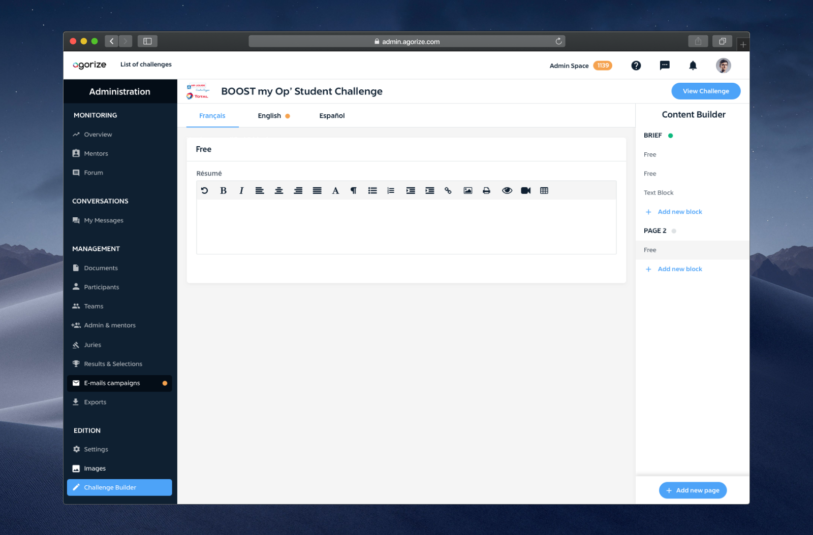
The user can navigate through page and blocks, create a page, edit a page, add a block and delete a block, directly in the sidebar.
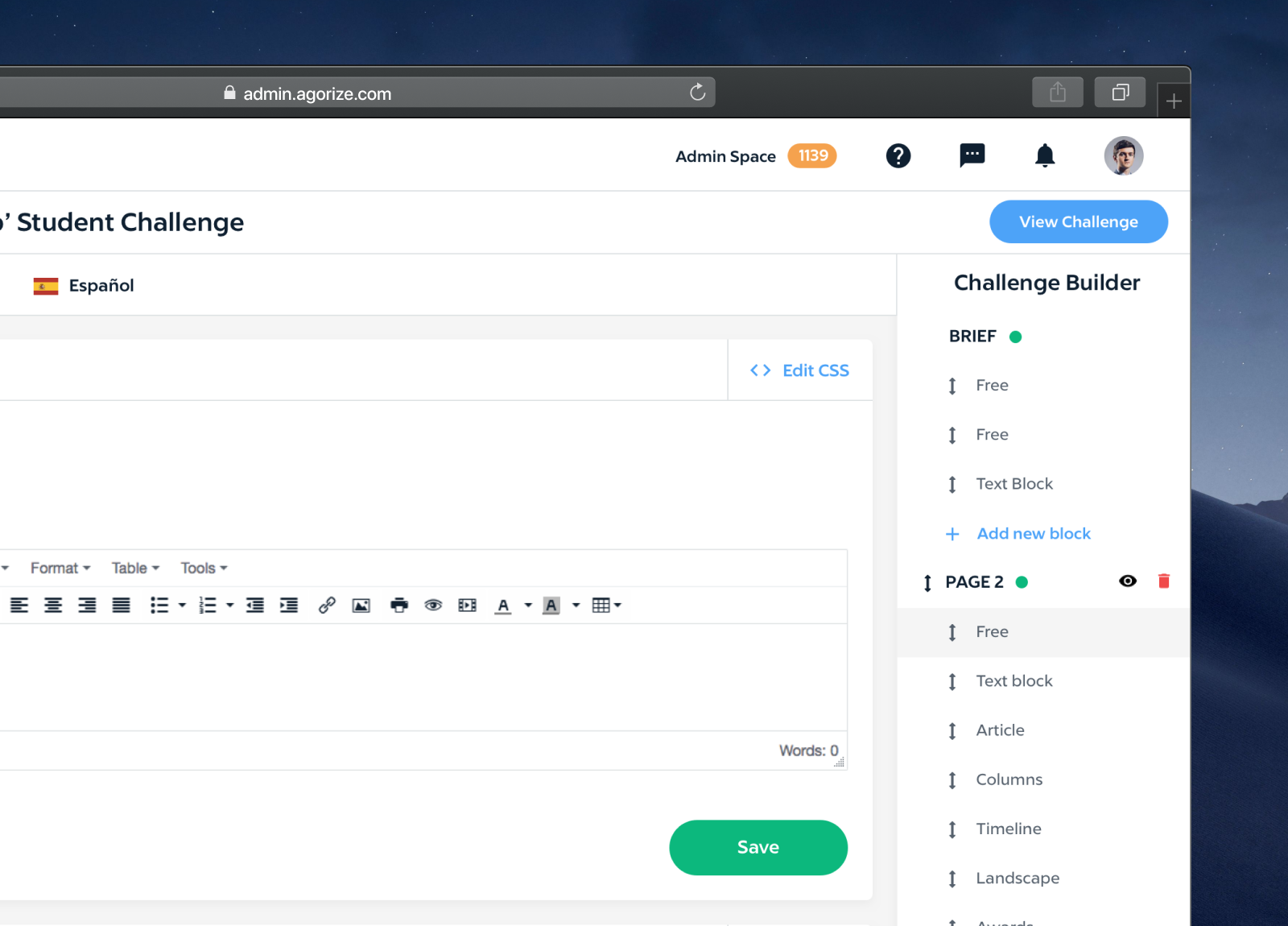
Solution delivered
Here's a challenge builder with many diffrent blocks and several pages created in the right sidebar.
