Allowing people to customize their Smart Remote interface.
Project Overview. Smart Remote is compatible with 650,000+ devices and comes with a setup app. Users can control devices indivudually or group them into a Scene to control several devices with one interface. Depending on devices added and Scenes created, controls are not laid out as expected, which lower the usage rate and generate negative reviews.
Role
User Research, Product Design (UX, UI, Interaction), Prototyping, Specifications.
Duration
6 weeks
Teammates
1 designer, 1 iOS developer, 1 Smart Remote developer, Head of Product
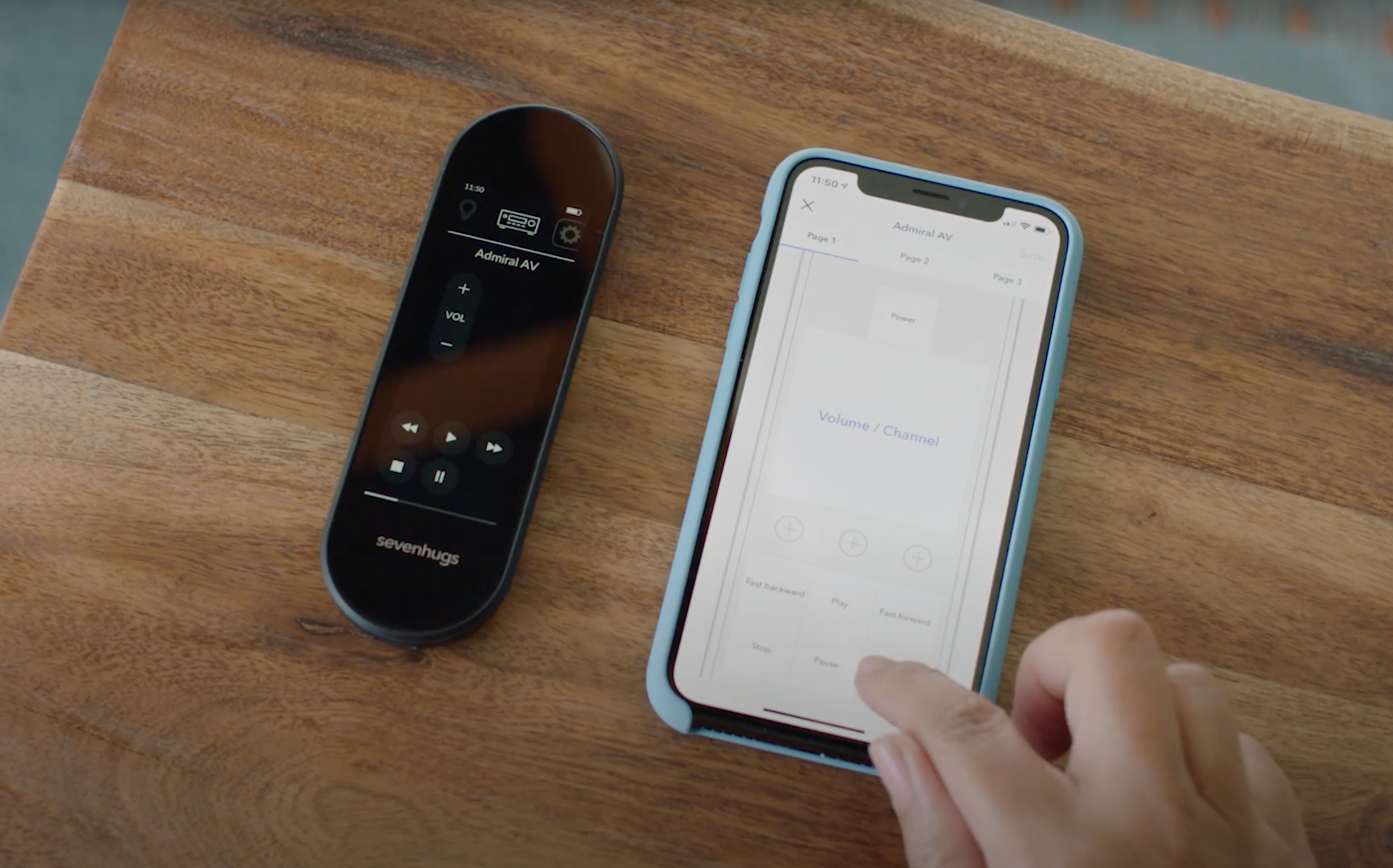
Problem. Depending on devices added and Scenes created, devices are not laid out as expected. In this Watch Roku Scene, most used controls are on several pages, which decrease the usage rate ang generate negative reviews.
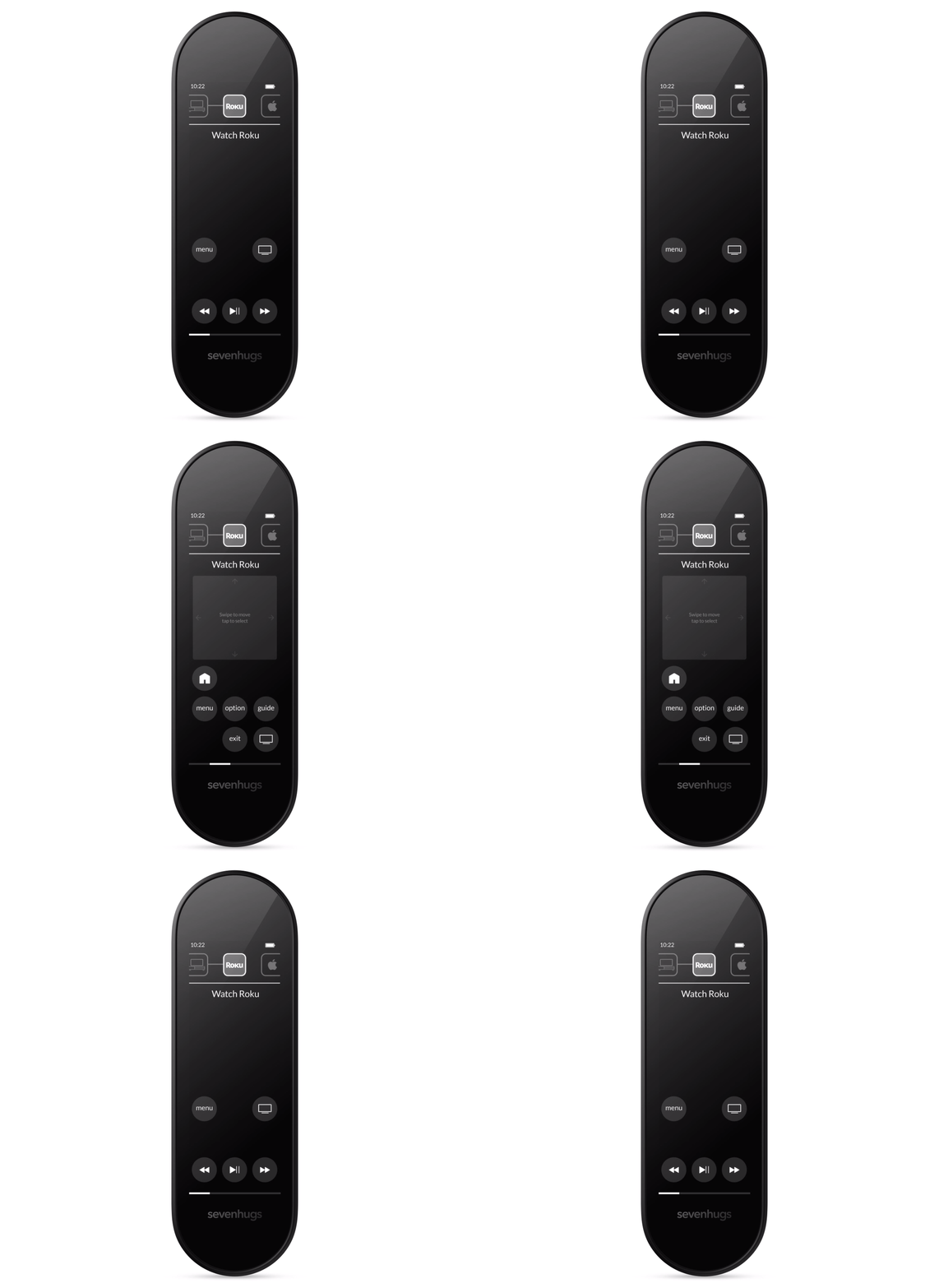
Solution & Outcome. From the setup app, users can add, remove and edit controls for devices added and Scenes created, which allow them to cover any use case. Even though the first version released is in beta and had some limitations, it significantly improved the usage rate of Smart Remote and we got many positive reviews mentioning this feature.

Customers reviews - See more reviews at bestbuy.com
Behind the scenes.
An in-depth look into the process.
User Research
For my research, I jumped on customer calls with the Custom Support team to understand their needs and expectations, I analysed customer feedback coming from different channels like Zendesk, our Community Forum, Twitter, etc. I also analysed data such as the number of scenes created, the number of devices added in a Scene, the most used controls. From the research I've done, I learnt that customers were expecting something close to a WYSIWYG experience and needed to be able to customize both controls and pages of controls to make Smart Remote their main and only remote.
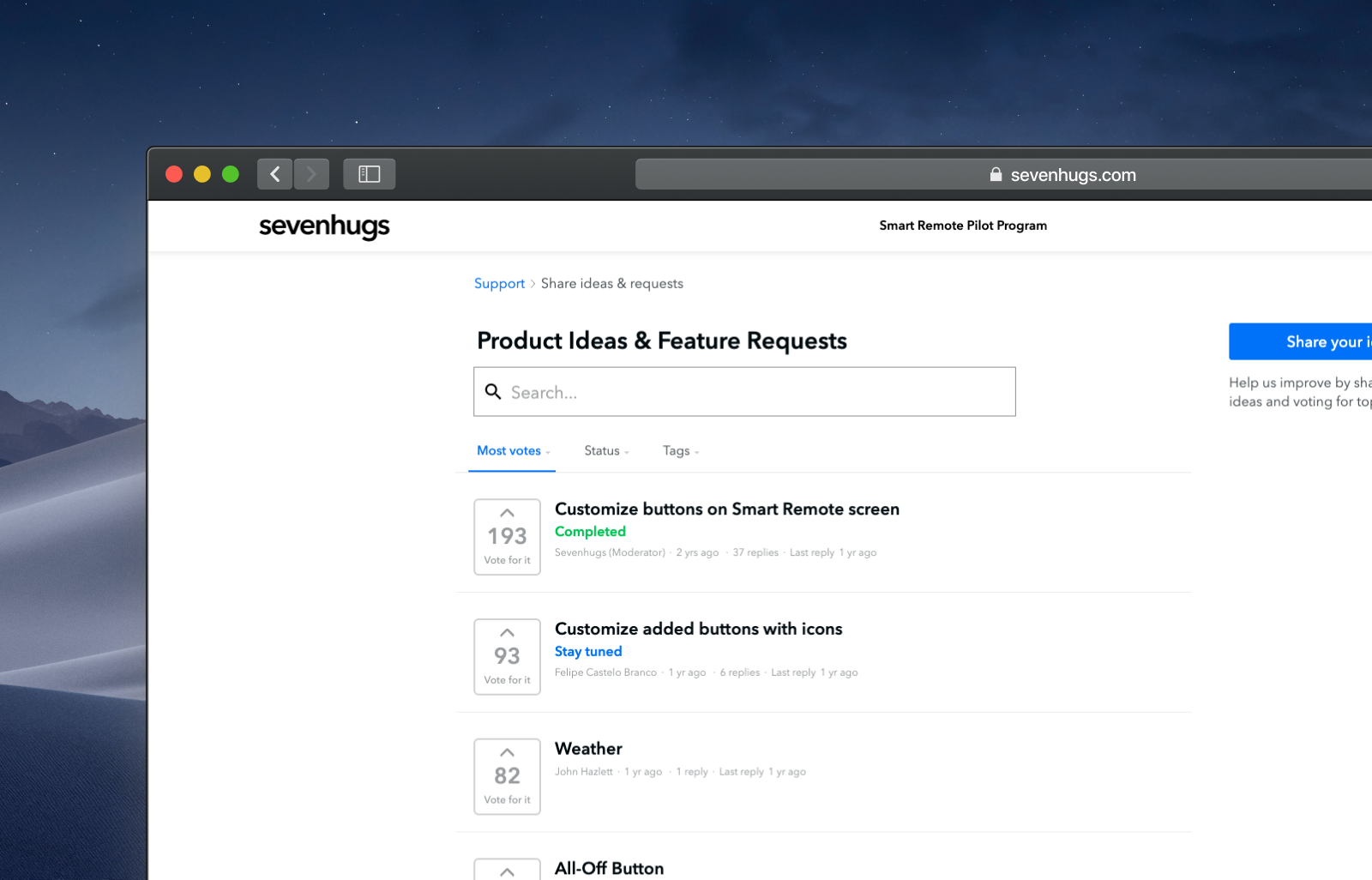
Customization features were the most requested during the Pilot/Beta program
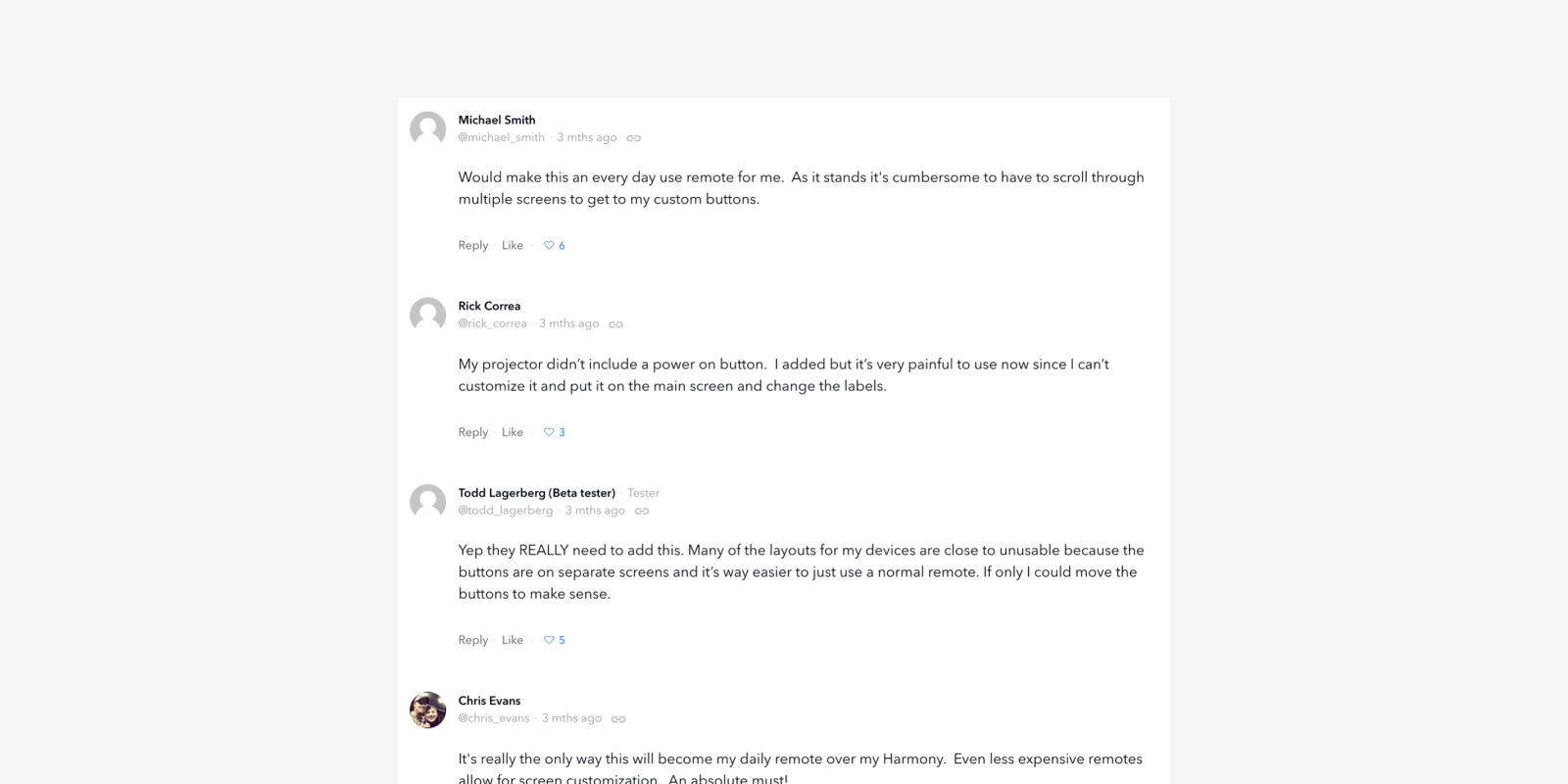
Example of comments on the feature requests page
Ideation v1 — Designing the MVP
The main challenge in designing this feature was how to design the screen listing controls on the Smart Remote interface. From the research I've done, I knew customers were expecting a WYSIWYG experience but this feature was a big project so I also had to use native components or custom components already developed to reduce development cost. I first used cells to represent controls, and I used tabs to navigate through pages of controls as it is the same paradigm on Smart Remote.
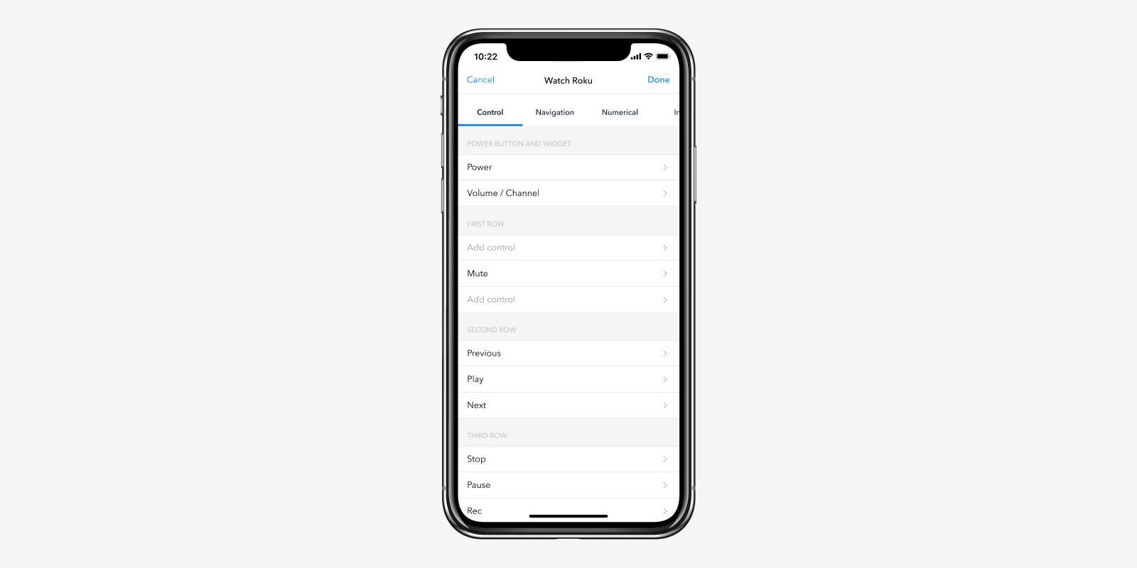
Ideation version 1
Ideation v2
Realizing this feature is quite difficult to use for a new customer, I started to improve celles to make the experience more visual.
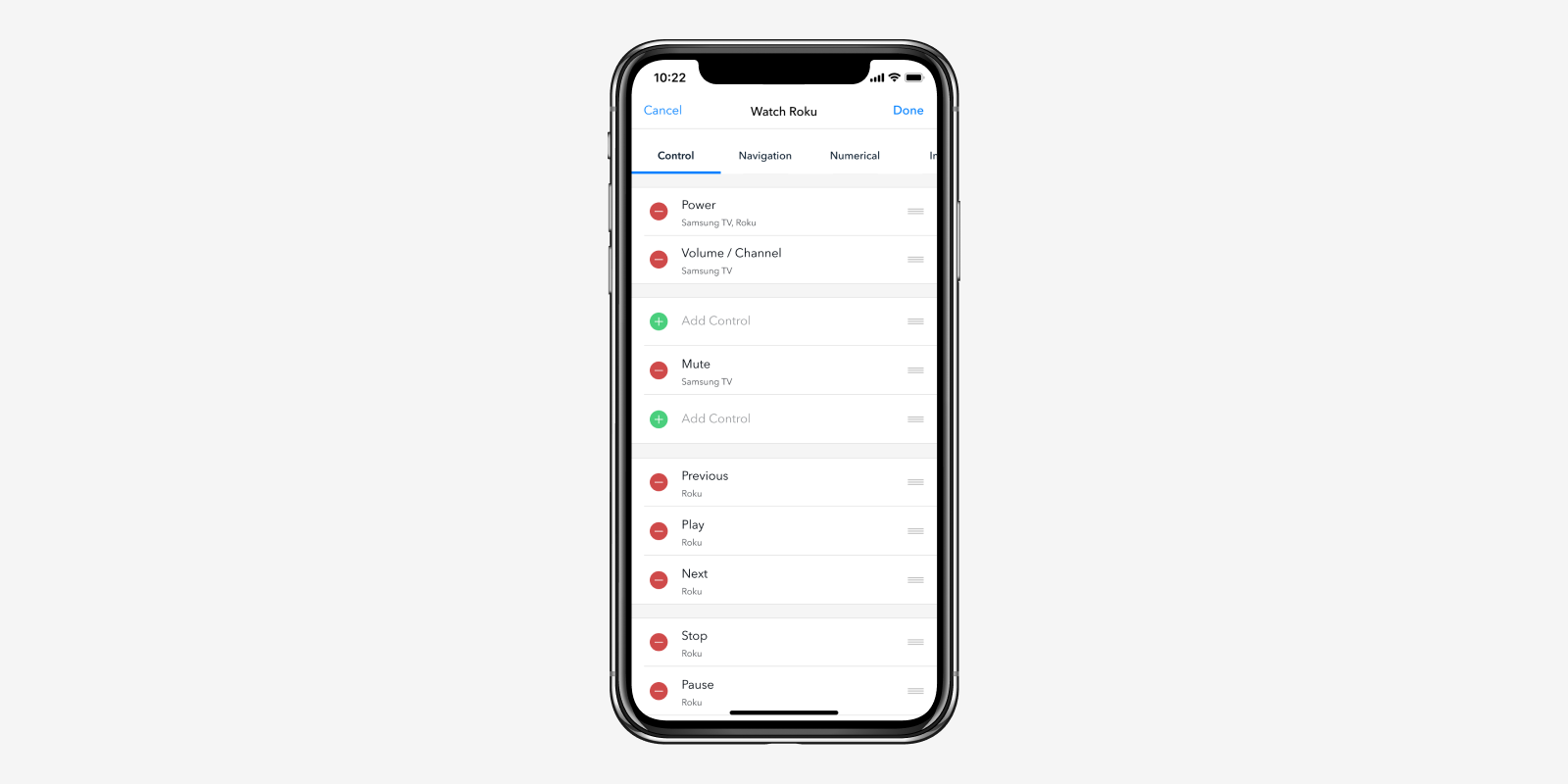
Ideation version 2
Ideation v3 — Getting visual
After reviewing the mockups with the team, we decided to go deeper in the WYSIWYG approach and create custom components so I started experimenting with an accurate representation of Smart Remote layout and grid.
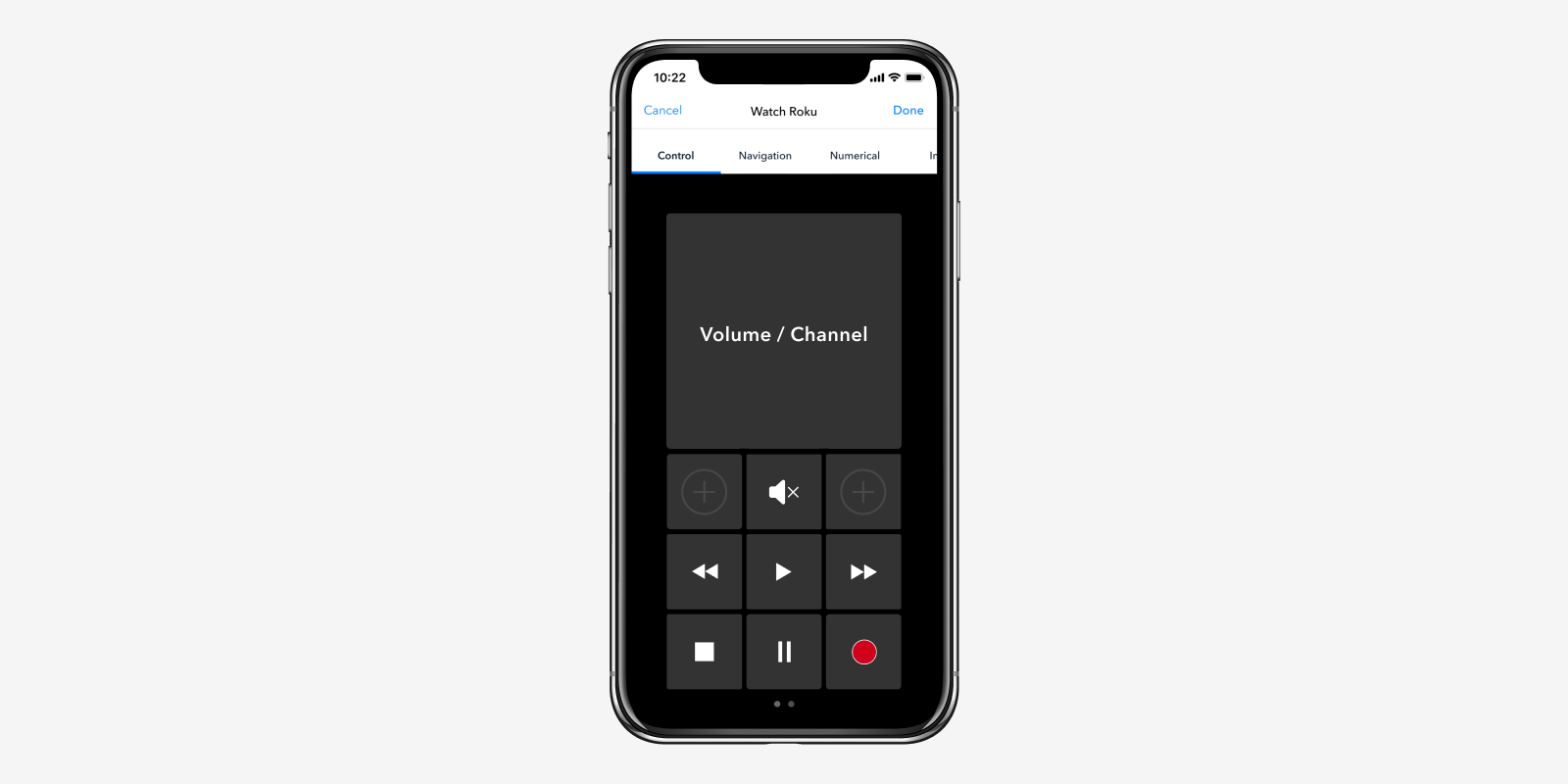
Ideation version 3
Ideation v4 — Final version
I needed to keep a light UI to be consistent with the design of the app, so I made an outline version of the remote, which also makes the controls stand out. For the page of inputs controls, we kept cells as inputs are listed in the same way on Smart Remote.
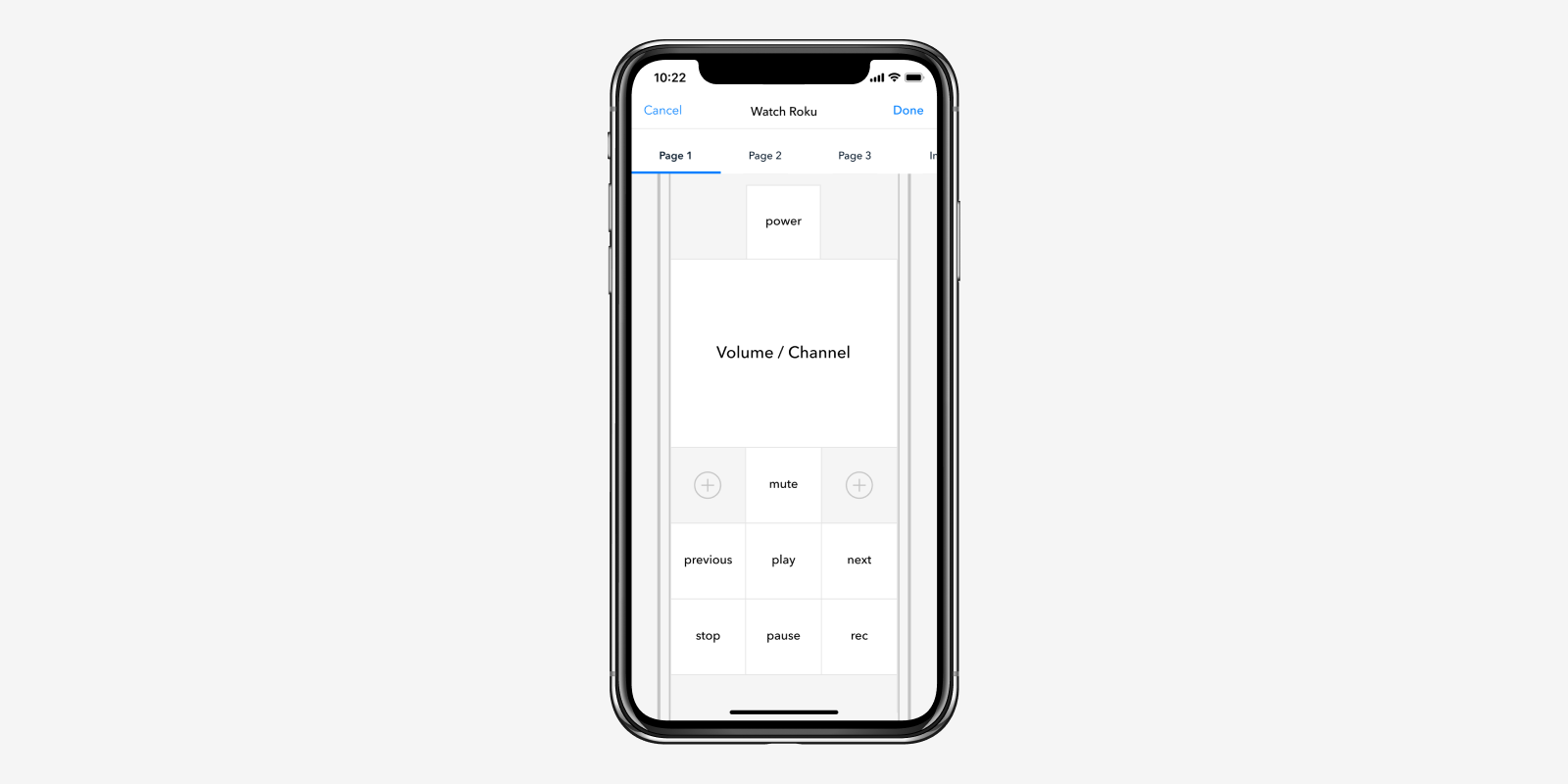
Ideation version 4
Interaction & Prototyping
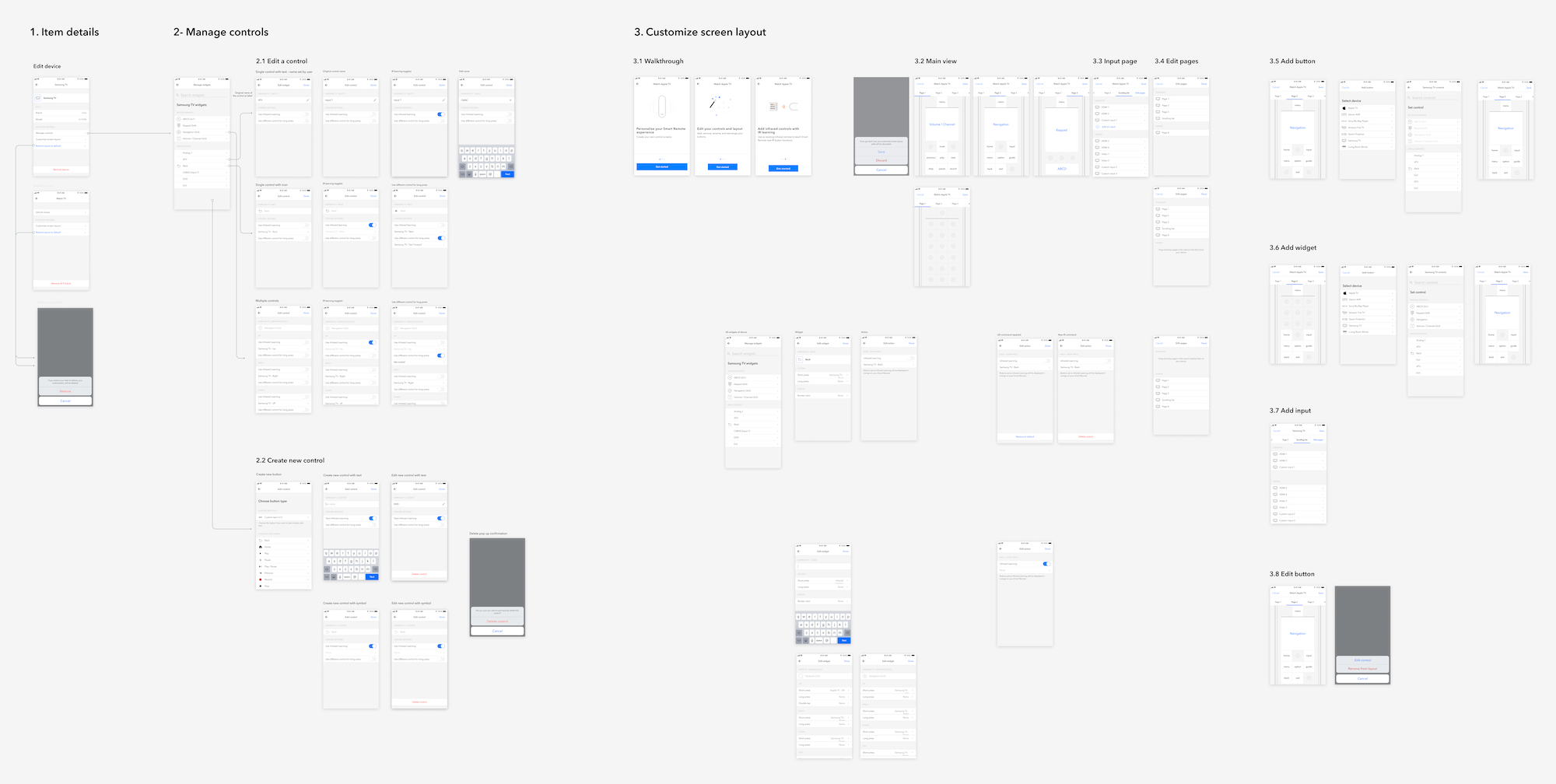
After validating the main screen, I designed the entire flow and made an interactive prototype in Figma to communicate with the team.
Specifications & Hand-off
We also wrote detailed specifications in Confluence to address all corner cases and technical limitations. For example, for the first version released (beta) we had a constraint of 10 devices customizations per user. Writing specifications with engineers allows to rise this kind of problems and to address them in the product experience.
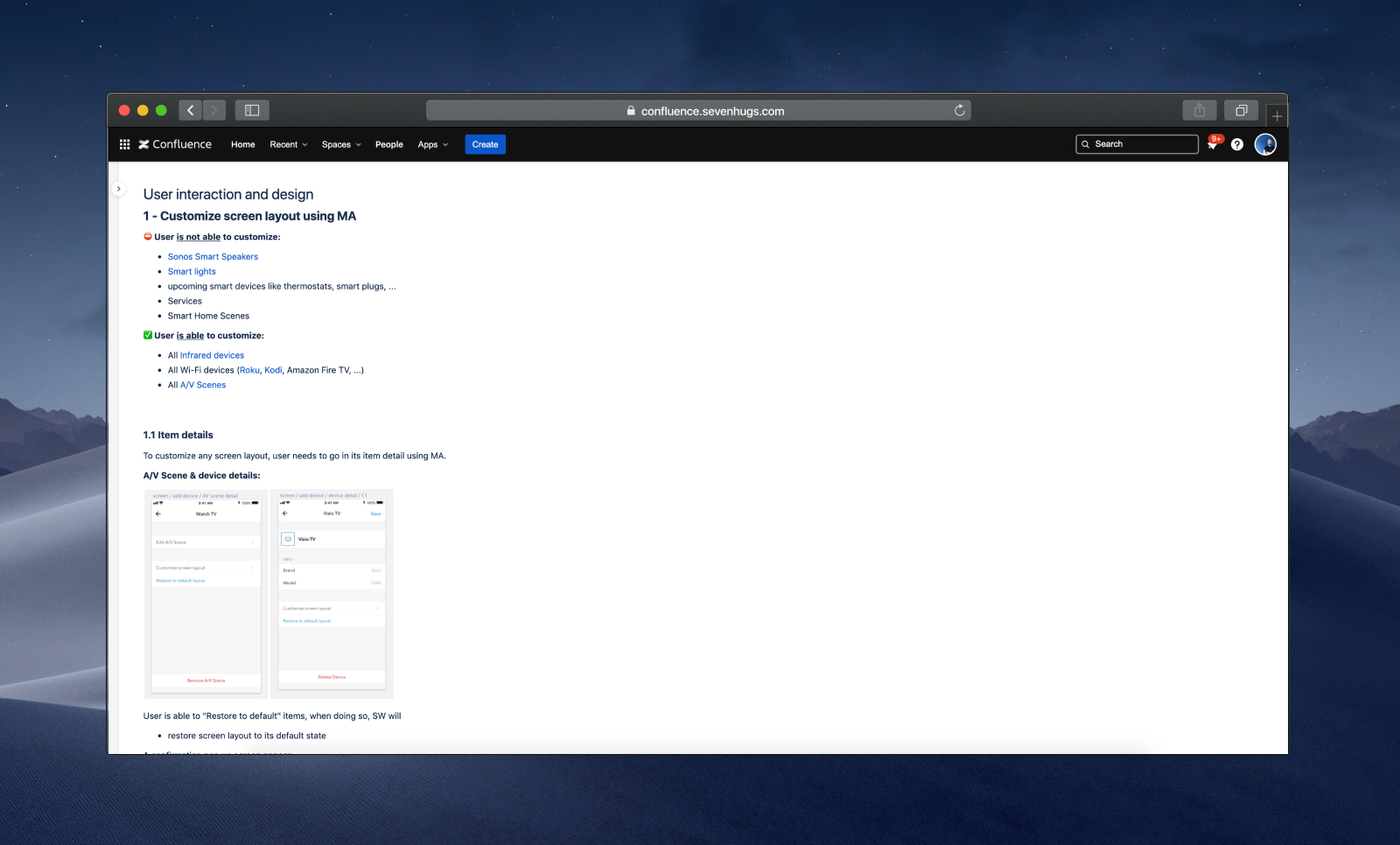
Sample of the specifications
Solution delivered
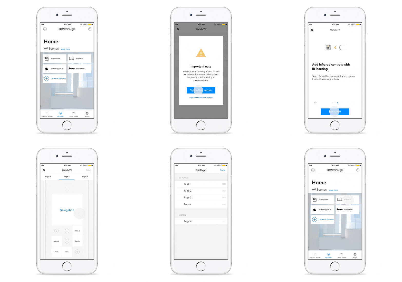
Here's a screen recording of the final product delivered, which includes additional screens like a popup alerting users about the beta version limitations or a walkthrough to help them understand the feature capabilities.
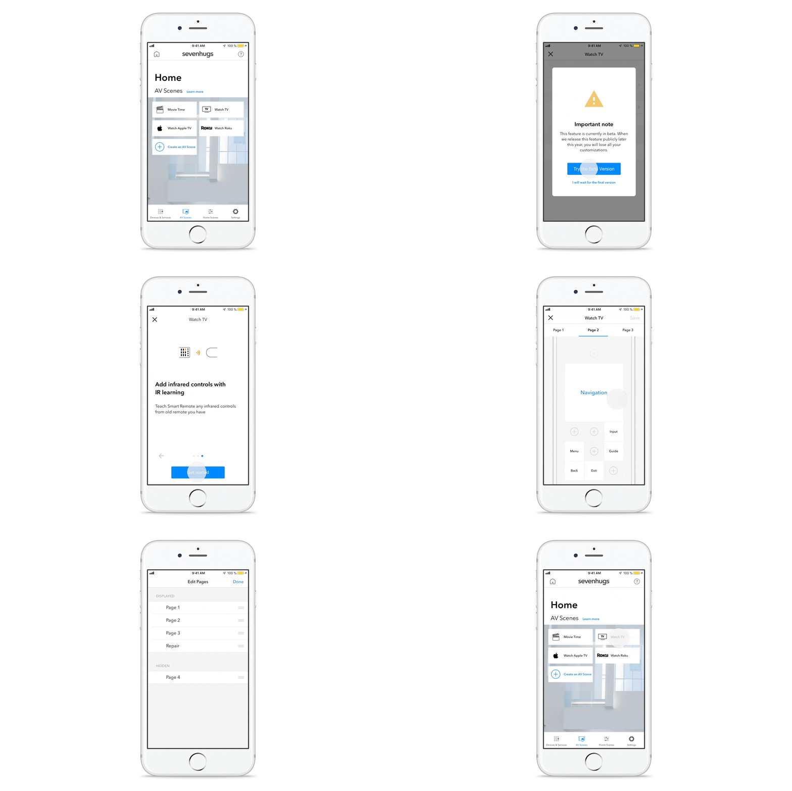
Screen recording of the solution delivered
Gathering users feedback for next iterations
After launching the beta version, we started collecting feedback from users from our community forum, zendesk and other channels to learn what worked well and what needed to improve. I also sometimes participated in the community forum to help and educate users on the feature possibilities and future improvements.
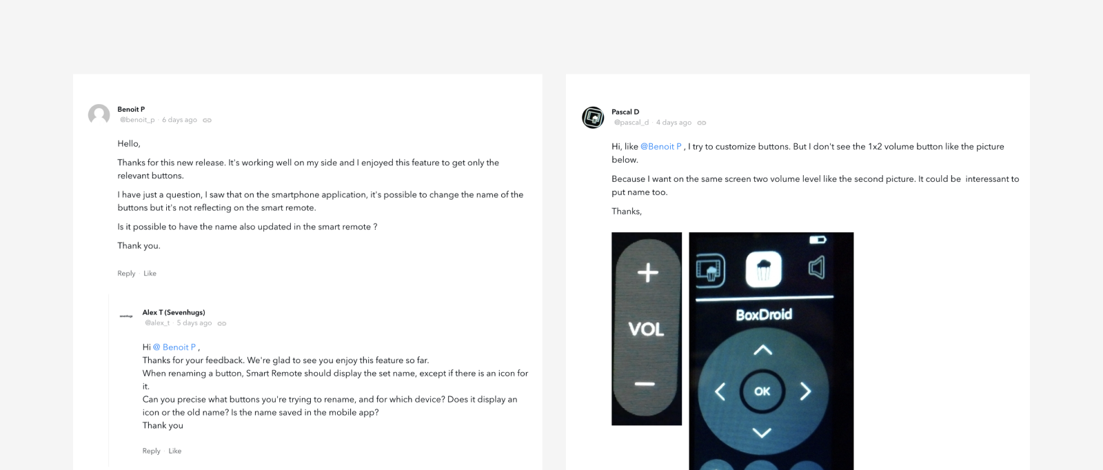
Exemple of user feedback posted on Sevenhugs Community Forum